
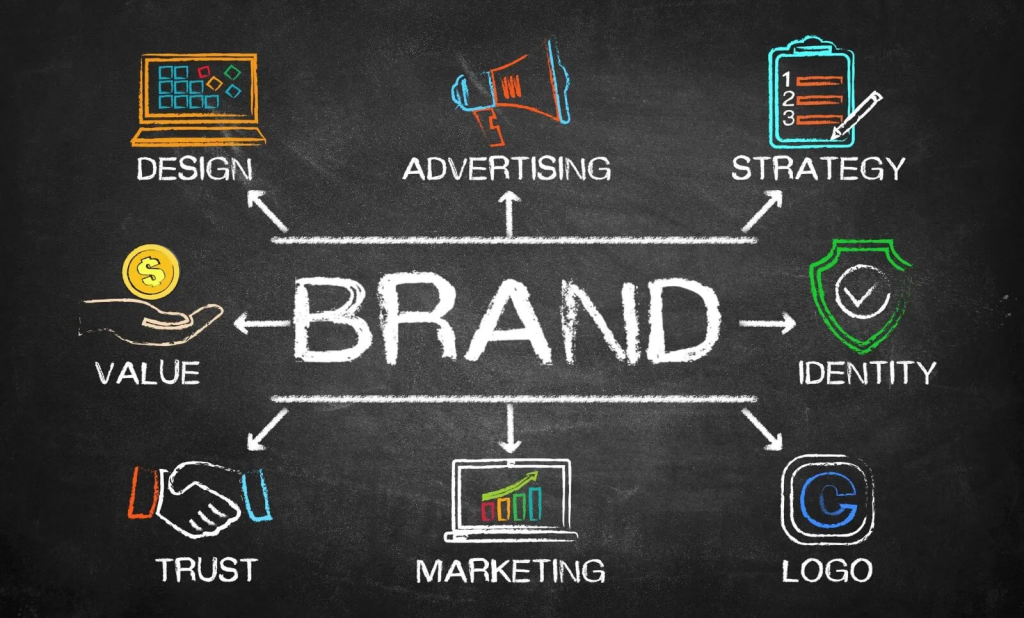
In today’s digital-first world, your logo often serves as the first touchpoint between your brand and potential customers. A well-crafted logo communicates your company’s values, personality, and purpose in an instant, making it one of the most crucial elements of your visual identity. Whether you’re launching a new venture, refreshing an existing brand, or simply interested in the principles of effective logo design, understanding the fundamentals of creating impactful digital logos is essential. This comprehensive guide explores the key strategies, principles, and practical tips for designing logos that not only look professional but effectively represent your brand across digital platforms.
Understanding Logo Fundamentals
Before diving into specific design techniques, it’s important to grasp what makes logos effective in the digital landscape.
The Purpose of a Logo
A successful logo serves multiple functions simultaneously:
- Brand identification: Instantly recognizable even at small sizes
- Differentiation: Distinguishes your brand from competitors
- Value communication: Reflects your brand’s personality and core values
- Memorability: Creates a lasting impression with viewers
- Versatility: Functions effectively across various digital and physical mediums
- Longevity: Remains relevant as your business evolves
Types of Logo Designs
Different logo styles serve different business needs:
- Wordmarks/Logotypes: Text-only logos featuring the company name (Google, Coca-Cola)
- Letterforms: Single letter designs (McDonald’s “M”, Honda “H”)
- Pictorial marks: Iconic, recognizable images (Apple’s apple, Twitter’s bird)
- Abstract marks: Geometric forms that represent the brand (Nike’s swoosh)
- Mascots: Character-based logos that embody the brand (KFC’s Colonel Sanders)
- Combination marks: Text and symbols used together (Burger King, Adidas)
- Emblems: Text inside a symbol or icon (Starbucks, Harley-Davidson)
Digital-First Considerations
Modern logos must prioritize digital application:
- Scalability: Functions at both tiny favicon sizes and large displays
- Screen rendering: Maintains clarity across different screen resolutions
- Color spaces: Works in RGB for digital while considering CMYK for any print applications
- Loading speed: Simple enough not to impact website performance
- Animation potential: Elements that can be animated for dynamic digital uses
- Social media compatibility: Works within various platform constraints and formats
Essential Design Principles for Digital Logos
Several fundamental principles guide effective logo design, especially for digital applications.
Simplicity and Clarity
The most enduring logos embrace simplicity:
- Minimal elements: Include only what’s necessary to communicate your identity
- Clean execution: Avoid cluttered details that disappear at small sizes
- Clear concept: Communicate a single, focused idea
- Reduced complexity: Use fewer colors, shapes, and fonts
- Immediate recognition: Viewable and understandable in under 2 seconds
Memorability and Distinctiveness
Standing out requires strategic uniqueness:
- Avoid generic symbols: Move beyond overused icons in your industry
- Create visual surprise: Include a distinctive twist or clever element
- Form unexpected connections: Link visual elements in original ways
- Leverage negative space: Consider how empty space can create meaning
- Distinctive silhouette: Recognizable by shape alone
Versatility and Scalability
Digital logos must function across contexts:
- Size adaptability: Maintains clarity from favicon (16×16 pixels) to billboard
- Responsive variations: Alternative versions for different size constraints
- Background flexibility: Works on light, dark, and complex backgrounds
- Single-color version: Functions in monochrome when necessary
- Static and animated forms: Designs that can be static or set in motion
Balance and Proportion
Visual harmony creates professional impressions:
- Visual weight distribution: Elements arranged to create stability
- Intentional asymmetry: When used, asymmetry should feel purposeful
- Golden ratio application: Using mathematical proportions for pleasing arrangements
- Consistent visual rhythm: Repeating elements or patterns with purpose
- Appropriate emphasis: Drawing attention to the most important elements
Color Psychology in Logo Design
Color choices significantly impact how your logo communicates your brand’s personality.
Strategic Color Selection
Colors should align with brand positioning:
- Red: Energy, passion, urgency, attention-grabbing
- Blue: Trustworthiness, reliability, professionalism, calmness
- Green: Growth, health, sustainability, freshness
- Yellow: Optimism, clarity, warmth, caution
- Purple: Creativity, wisdom, luxury, spirituality
- Orange: Enthusiasm, friendliness, affordability, playfulness
- Black: Sophistication, luxury, authority, simplicity
- White: Purity, simplicity, cleanliness, minimalism
Digital Color Considerations
Technical aspects of color in digital environments:
- Color accessibility: Ensuring sufficient contrast for visibility
- Web-safe considerations: Colors that render consistently across devices
- RGB values: Optimized for screen display
- Reduced color palettes: 1-3 colors typically work best
- Color variations: Alternative palettes for different backgrounds
Color Trends vs. Timelessness
Balancing contemporary appeal with longevity:
- Trend awareness: Understanding current color preferences while not being bound by them
- Industry expectations: Considering standard color associations in your field
- Brand personality alignment: Colors that reflect your unique positioning
- Cultural considerations: Different color meanings across global markets
- Long-term vision: Colors that will still represent your brand in 5-10 years
According to research on brand identity development, companies that maintain consistent colors across their branding increase recognition by up to 80%, highlighting the importance of strategic color selection in logo design.
Typography and Lettering
For wordmarks or combination logos, typography plays a crucial role in brand perception.
Font Selection Strategy
Choosing typefaces that align with brand personality:
- Serif fonts: Tradition, reliability, respect, sophistication
- Sans-serif fonts: Modernity, cleanness, objectivity, minimalism
- Script fonts: Elegance, creativity, personalization, authenticity
- Display fonts: Uniqueness, expressiveness, character, memorability
- Monospaced fonts: Technical precision, functionality, clarity
Custom Lettering Benefits
Beyond standard fonts:
- Uniqueness guarantee: No other brand will have identical typography
- Perfect fit: Letters designed specifically for your logo’s needs
- Character consistency: Harmonious relationship between all letters
- Legal protection: Easier to trademark unique lettering
- Brand personality: Letters that specifically embody your brand characteristics
Typography in Digital Environments
Technical considerations for text in logos:
- Readability at small sizes: Maintaining legibility on mobile devices
- Letter spacing (tracking): Appropriate space between characters
- Kerning precision: Fine-tuning space between specific letter pairs
- Weight considerations: How font thickness impacts digital display
- Web font compatibility: Ensuring consistency with website typography

The Design Process
Following a structured approach leads to more successful logo outcomes.
Research and Discovery
Laying the groundwork for effective design:
- Brand audit: Analyzing existing visual identity if applicable
- Competitor analysis: Understanding what exists in your market space
- Target audience research: Identifying what appeals to your ideal customers
- Brand attributes listing: Defining 3-5 key characteristics your brand embodies
- Inspiration collection: Gathering reference material while avoiding direct imitation
- Design brief development: Creating clear parameters for the project
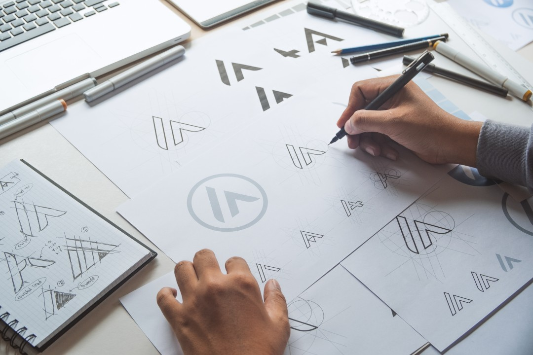
Conceptualization and Sketching
Developing ideas before digital implementation:
- Mind mapping: Connecting concepts related to your brand
- Thumbnail sketching: Quick, rough idea generation (aim for 20+ concepts)
- Concept refinement: Selecting promising directions for development
- Iteration cycles: Exploring variations of the strongest concepts
- Feedback collection: Getting early input on direction (not details)
- Concept selection: Choosing the strongest options for digital development
Digital Execution
Bringing selected concepts to life:
- Vector-based tools: Using Adobe Illustrator, Affinity Designer, or similar software
- Grid-based construction: Building with mathematical precision
- Shape refinement: Perfecting curves, angles, and proportions
- Typography customization: Modifying or creating letterforms as needed
- Color experimentation: Testing various color applications
- Version comparison: Evaluating alternatives side-by-side
Testing and Refinement
Ensuring real-world effectiveness:
- Size testing: Viewing at multiple scales from very small to large
- Context placement: Testing in realistic application environments
- Device testing: Checking appearance on different screens
- Color background variations: Ensuring versatility across applications
- Feedback integration: Refining based on client and audience input
- Final precision adjustments: Perfecting all technical details
Technical Considerations for Digital Logos
Technical excellence ensures your logo functions properly across digital applications.
File Formats and Usage
Understanding appropriate formats for different contexts:
- SVG: Scalable vector format ideal for web use
- PNG: Raster format with transparency for digital applications
- JPG: Compressed format for simple applications without transparency
- PDF: Vector format for print applications
- EPS/AI: Editable vector formats for design professionals
- ICO: Specialized format for favicons
Technical Precision
Details that demonstrate professional execution:
- Perfect symmetry: When intended, elements should be precisely symmetrical
- Aligned anchor points: Clean vector paths without unnecessary points
- Consistent stroke weights: Even thickness where appropriate
- Optical adjustments: Compensating for visual illusions that affect perception
- Proper curve smoothing: Natural, flowing curves without corner artifacts
- Pixel-fitting: Aligning elements to pixel grid for sharp rendering at small sizes
According to graphic design fundamentals research, logos designed with technical precision not only look more professional but also reproduce more consistently across different applications and media types.
Responsive Logo Design
Creating variations for different contexts:
- Logo system development: Creating a family of related marks for different uses
- Simplified versions: Progressively reduced complexity for smaller sizes
- Horizontal and vertical layouts: Different orientations for various spaces
- Responsive stacking: Elements that reposition based on available space
- Icon extraction: Using a single element from the main logo when appropriate
Common Pitfalls to Avoid
Understanding frequent mistakes helps ensure better outcomes.
Design Errors
Aesthetic issues that undermine effectiveness:
- Excessive complexity: Too many elements, colors, or details
- Trend dependency: Following fads that will quickly date the design
- Poor contrast: Elements that blend together or disappear
- Inappropriate style: Design approach that doesn’t match brand personality
- Illegible typography: Text that’s difficult to read, especially at small sizes
- Cliché imagery: Overused symbols like light bulbs for ideas, handshakes for partnership
- Forced concepts: Trying to communicate too many ideas in one mark
Technical Mistakes
Execution problems that affect functionality:
- Rasterized delivery: Providing only pixel-based files instead of vectors
- Inconsistent application: Varying the logo in ways that weaken recognition
- Missing color variants: Not providing versions for different backgrounds and uses
- Poor scalability: Details that break down or become muddy at different sizes
- Software-specific effects: Using features that don’t translate across programs
- Non-standard fonts: Typography that’s not properly outlined or licensed
- Incorrect color spaces: Using CMYK values for digital applications
Logo Design Tools and Resources
Several excellent options exist for creating professional logos.
Professional Software
Industry-standard tools for logo creation:
- Adobe Illustrator: The industry standard for vector logo design
- Affinity Designer: Powerful alternative with one-time purchase model
- CorelDRAW: Vector software with specific logo design features
- Sketch: Mac-only design tool popular for digital-first design
- Figma: Collaborative design tool with excellent vector capabilities
Accessible Options
More approachable tools for beginners:
- Canva: Template-based design tool with logo creation features
- Looka: AI-powered logo generator with customization options
- Inkscape: Free, open-source vector graphics editor
- Gravit Designer: Free vector design software with pro upgrade option
- Logo Maker apps: Various mobile applications for on-the-go design
Learning Resources
For developing logo design skills:
- Online courses: Platforms like Udemy, Skillshare, and LinkedIn Learning
- YouTube tutorials: Free guidance on specific techniques and tools
- Design books: Classic texts on logo design principles
- Design blogs: Sites like Brand New and Logo Lounge for inspiration and analysis
- Local workshops: In-person learning opportunities in many communities
Implementation and Brand Consistency
Creating the logo is just the beginning; proper implementation ensures its effectiveness.
Style Guide Development
Documentation ensures consistent application:
- Logo variations: All approved versions and when to use each
- Clear space requirements: Minimum area around the logo to remain empty
- Minimum size specifications: Smallest allowable reproduction size
- Incorrect usage examples: Demonstrations of how not to use the logo
- Color specifications: Exact values in RGB, HEX, and CMYK
- Typography details: Fonts used in and alongside the logo
Digital Implementation
Proper technical application:
- Favicon creation: Optimized version for browser tabs and bookmarks
- Social media profile images: Correctly formatted for each platform
- Email signature integration: Professional application in communications
- Website implementation: Proper placement and formatting on your site
- App icons: Modified versions for application icons if relevant
- Digital advertising: Guidelines for use in various ad formats
Conclusion
A well-designed digital logo serves as the cornerstone of your brand’s visual identity, communicating your essence at a glance. By understanding and applying the fundamental principles of effective logo design—simplicity, memorability, versatility, and technical excellence—you can create a mark that not only looks professional but effectively represents your brand across the digital landscape.
Remember that the most successful logos aren’t created in isolation but as part of a comprehensive brand identity system. Your logo should work harmoniously with your color palette, typography, imagery style, and overall brand voice to create a cohesive experience for your audience.
Whether you’re designing a logo yourself or working with a professional designer, the principles outlined in this guide will help you evaluate design options and make informed decisions. A thoughtfully crafted logo becomes more than just a graphic—it transforms into a valuable asset that builds recognition, communicates values, and supports your brand’s growth for years to come.